A list of all works; to learn more about a project, click its title.
How Information Worlds Shape Our Response to Climate Change (Project Information Literacy)
Drawing on a survey of more than 4,500 members of the general public and almost 1,600 college students enrolled at nine colleges and universities across the country, this latest open access publication from Project Information Literacy (PIL) asks not what people living in America know about climate change, but how they know it. In a year-long study, PIL examined the ways in which people engage with and respond to climate change news and information; how these interactions shape their perceptions of the worldwide climate emergency; and how these attitudes impact their willingness to take action, no matter how small it seems.
Deconstructing Proxies

What is the relationship between dance and technology? How can the kinesthetic dimensions of interaction be made visible? This case study, written in collaboration with Ilya Vidrin, reflects on the role of technology, data, artistic performance, and design as media of inquiry into these provocations in the dance theatre production Proxies currently in development.
Behind the Camera: Interactive Timeline
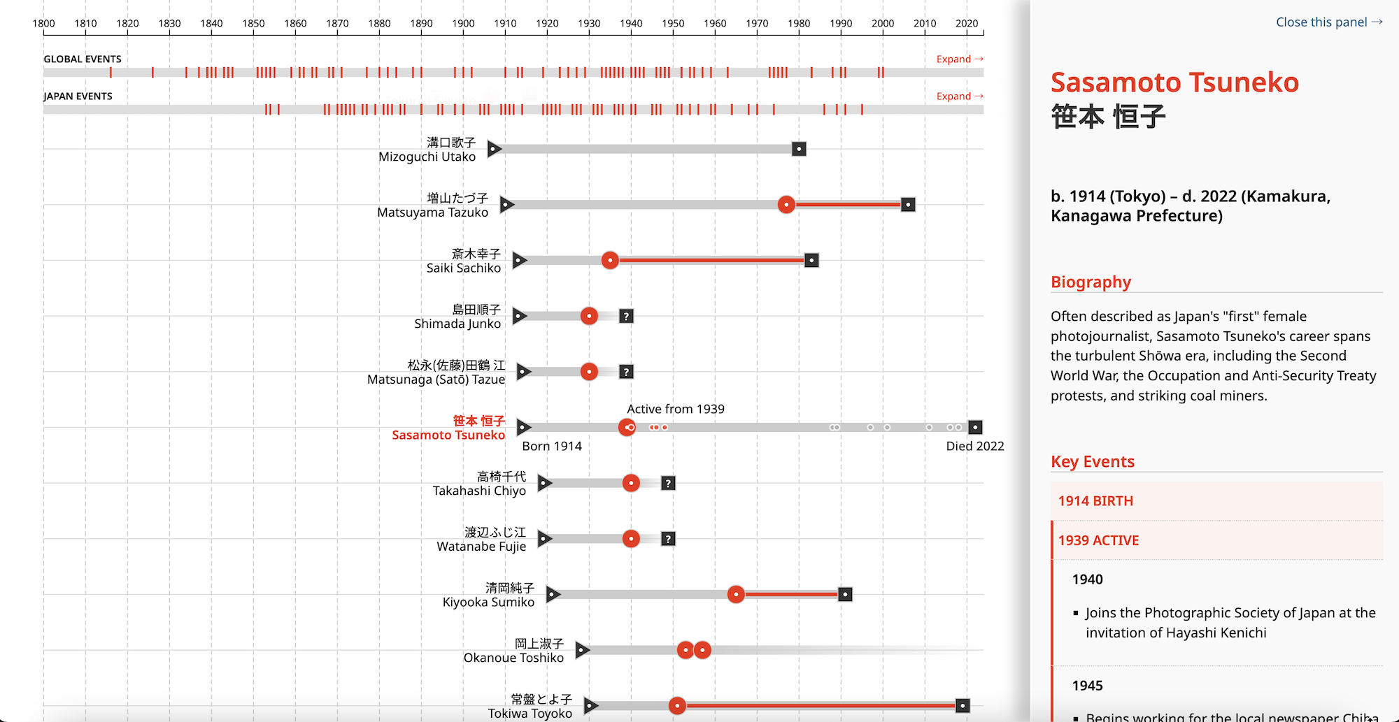
Behind the Camera is an open-source website that creates new critical directions on the history of photography, feminist art history, and the history of modern Japan. Designed and developed in collaboration with Behind the Camera, this interactive timeline makes visible the creative work, lives, and bibliographic records of Japanese women photographers since the early 1800s, situating them in broader photographic historical contexts in Japan and the world at large.
Design Vocabularies
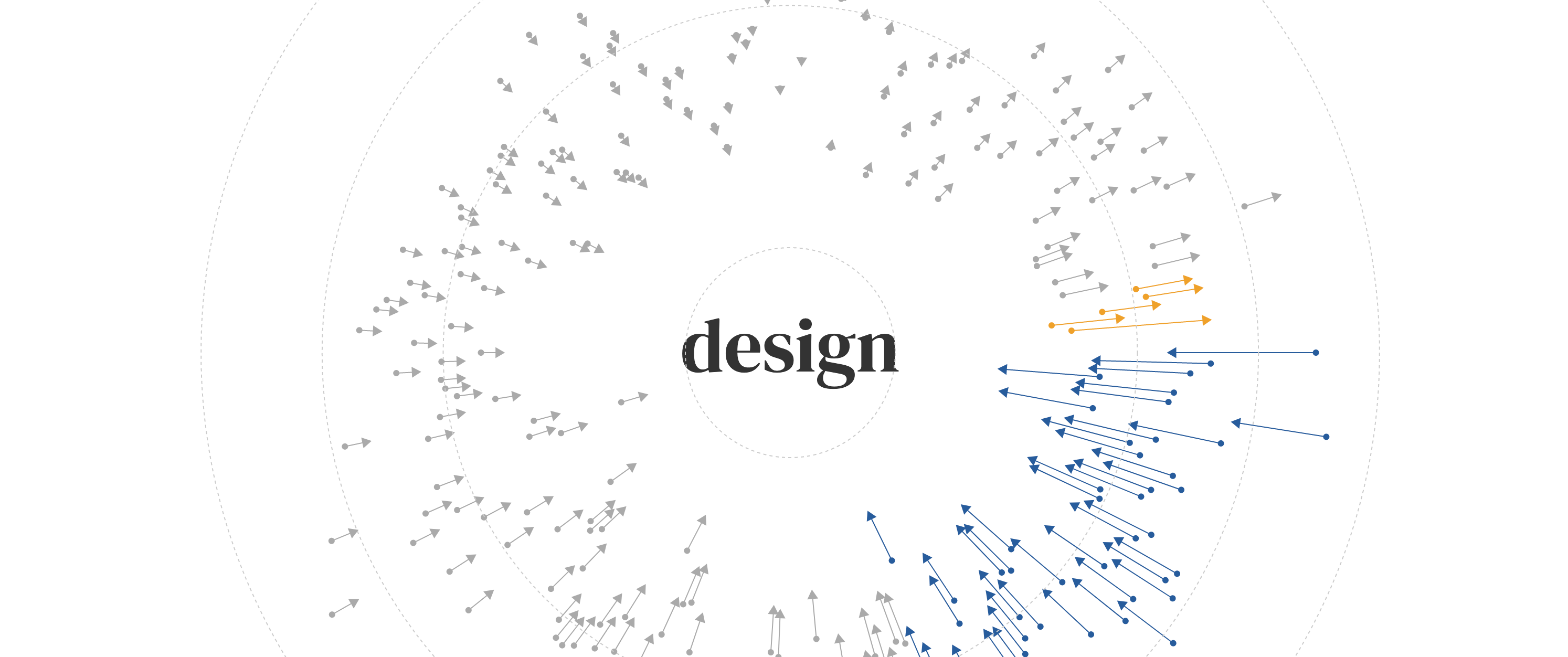
What do we mean when we say the word design? We encounter design in many kinds of spaces – public services, academic research, professional practice, and mass media. This work investigates the semantic spaces we stumble into through these encounters, through a textual analysis of conference proceedings from the Design Research Society Biennial Conference Series and articles in the Design Studies journal. Using word vectors, this work examines how the language of design has changed over time, offering provocations on where design discourse has come from, where it is now, and where it might go in the future.
Interactive Visualizations for A People's EPA
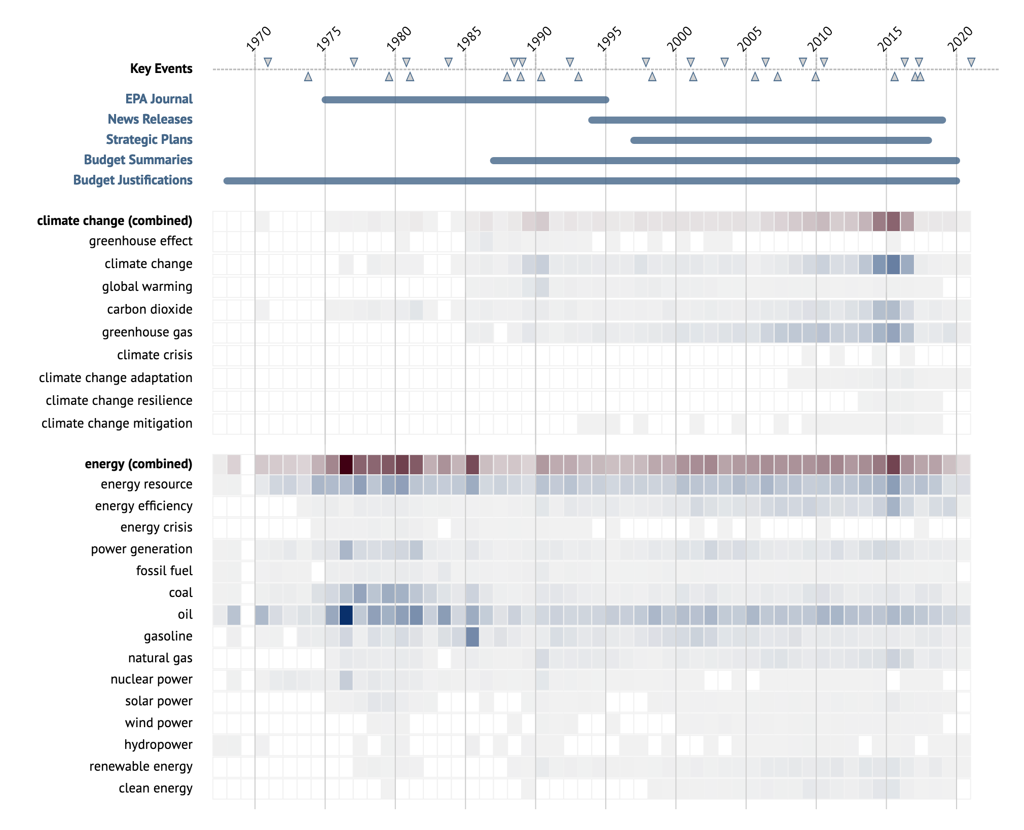
A People's EPA (APE) is a project of the Environmental Data and Governance Initiative (EDGI) that provides public resources for understanding the history, function, and purpose of the Environmental Protection Agency. In collaboration with Leif Fredrickson and Jessica Varner, co-curators of APE, I designed and engineered a series of interactive exploratory data visualizations that allow users to examine the agency's history of enforcement of environmental policy.
Proxies of Resistance
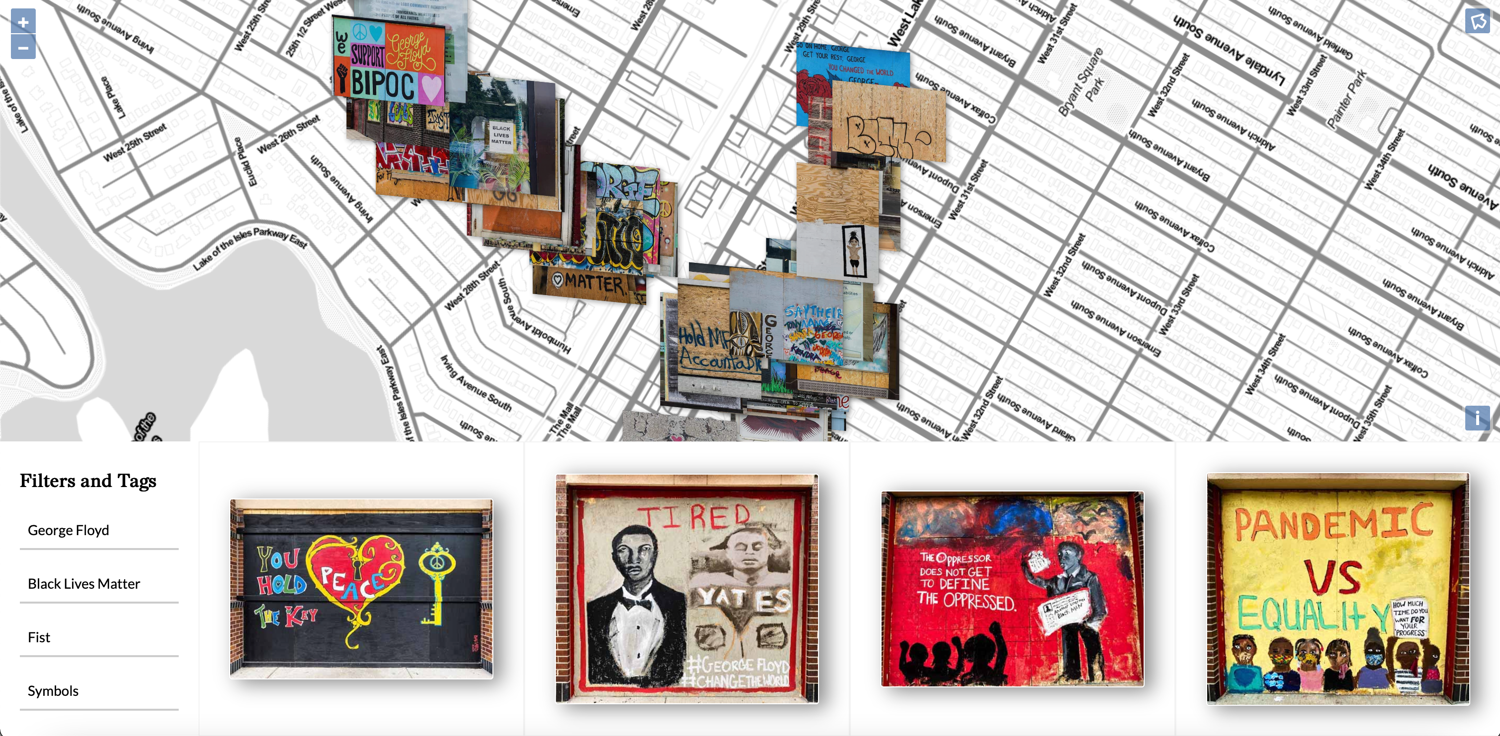
In May 2020, George Floyd, a Black man, was murdered by a white police officer in Minneapolis, Minnesota. In the months that followed, demonstrations erupted across the country protesting against police brutality and racial violence, including in the Minneapolis neighborhoods surrounding the location where Floyd was murdered. Many months later, some of the ephemera of these demonstrations — street art painted on the walls and windows of businesses, demanding justice — persisted long enough into the end of the summer of 2020 for my sibling and I to photograph them. This project reflects on an attempt to document a fading record of a summer of turmoil, situating the street art in larger narratives and experiences of trauma.
Creative Coding for the Web
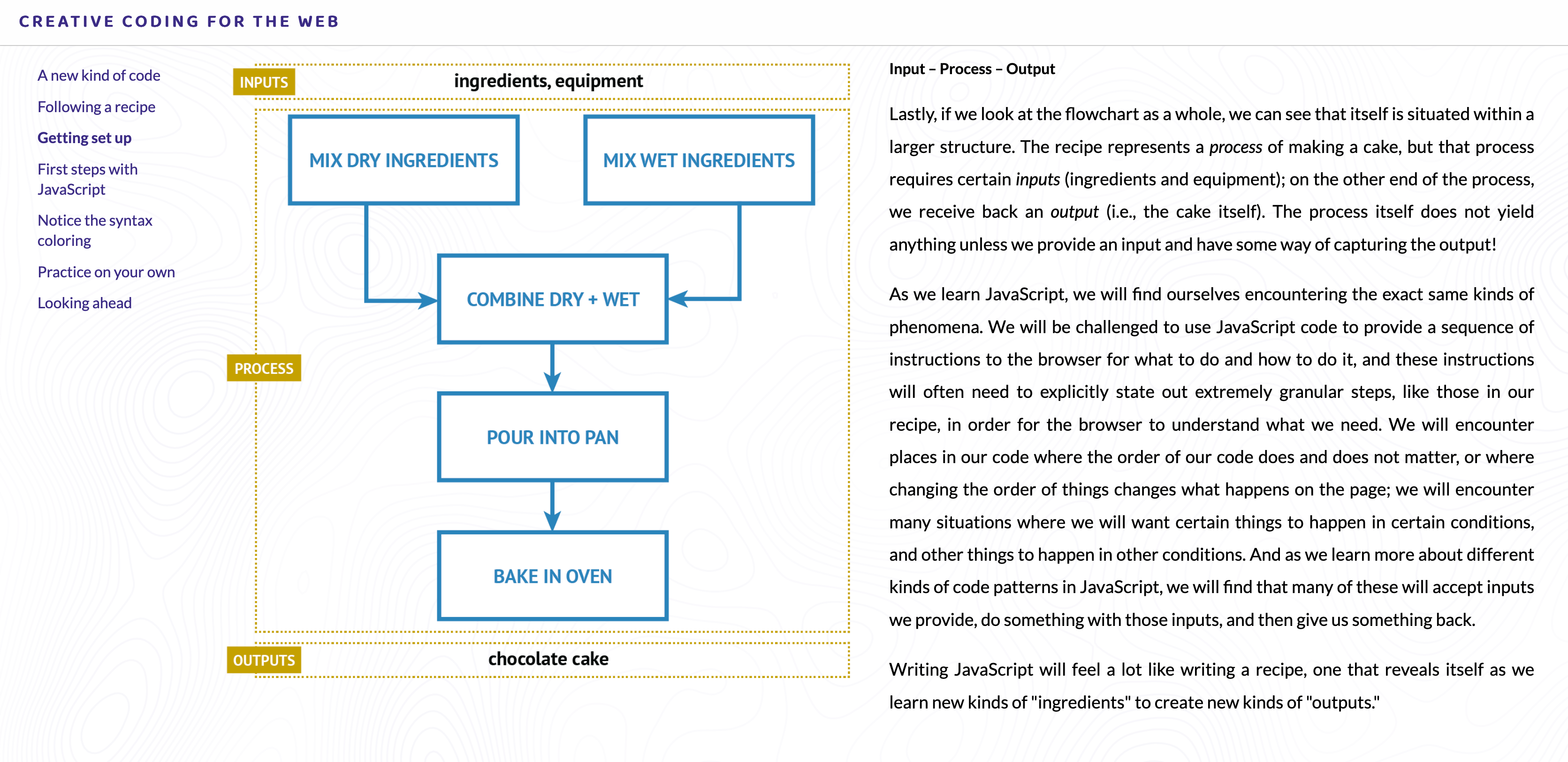
Many existing textbooks that provide an introduction to programming for the web are designed with programmers and developers in mind. For designers, this developer-oriented approach to programming can feel overwhelming and discouraging. As an alternative, Steven teaches web programming through the notion of code as medium of design, considering the many ways that a sample of code functions as a designed artifact. The tutorials embedded within this work, Creative Coding for the Web, offer a design-forward approach to web programming fundamentals, aimed towards design audiences.
(Project Information Literacy) Covid-19: The first 100 days of U.S. news coverage
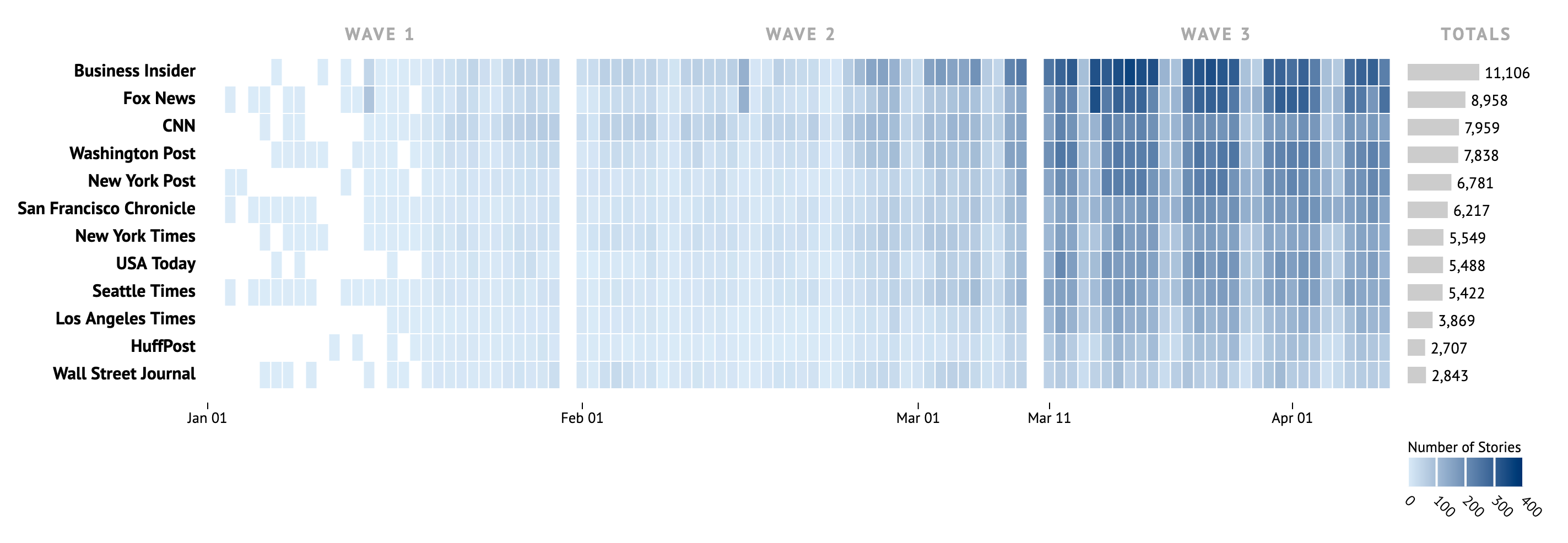
In this series, Project Information Literacy (PIL) explores U.S. media coverage of the Covid-19 outbreak during the first 100 days of 2020. In the first report, PIL examines the shape and flow of the coronavirus story across time and digital spaces by using a large sample of stories from a range of news sources; in the second, PIL analyzes how a sample of photos from 12 news outlets visually represented the story. The purpose of this special series is to examine how mainstream, widely-read news outlets responded to a rapidly changing story as it exploded into the largest global health crisis in a century.
Silenced Histories
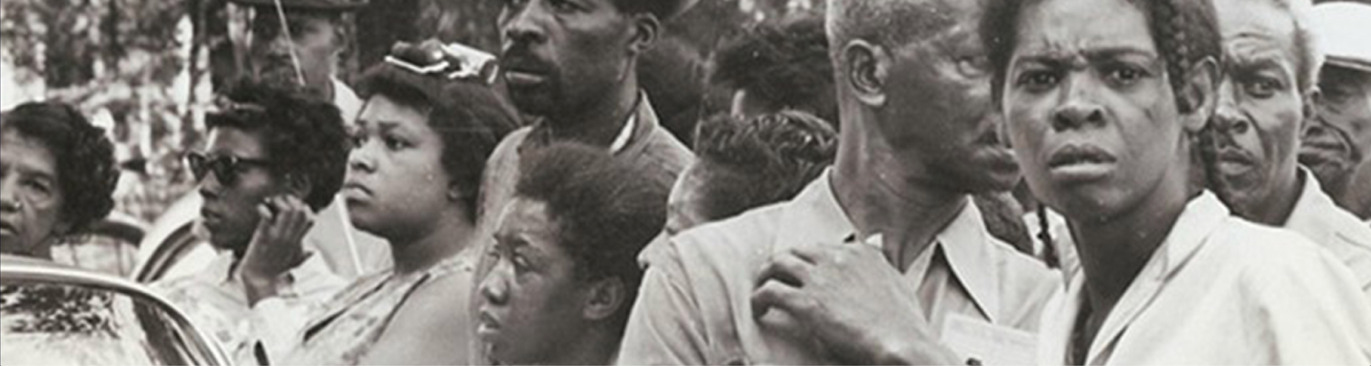
The Civil Rights and Restorative Justice Project (CRRJ) at Northeastern University (Boston, MA) conducts research and supports policy initiatives on anti-civil rights violence in the United States. In collaboration with CRRJ, the NuLawLab, and the NULab for Texts, Maps and Networks, I helped design and engineer an interactive map and timeline to enable exploration of primary source materials in the Burnham Nobles Archive.
Kanji Metamorphoses

Kuzushiji, cursive Japanese characters used in classical Japanese texts, are known for their difficulty. Mastering them requires years of training, and some scholars devote their entire careers to learning how to read them. Why are they so notoriously difficult? The reason is that kuzushiji can and often do look very different from their modern equivalent. This project examines just how different kuzushiji are from modern Japanese kanji by visualizing transformations between modern kanji and kuzushiji stroke patterns.
Climate Frameshifts
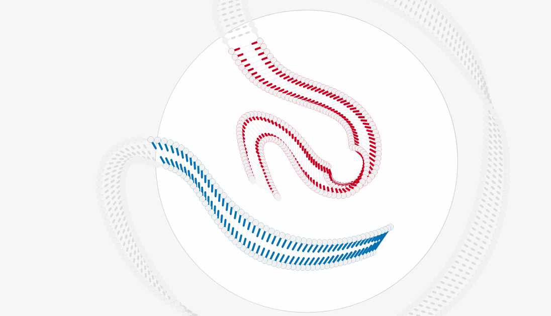
The Trump administration has made repeated attacks on climate science, hitting policymakers, scientists, and the general public alike with a united rhetoric that claims climate change is nothing but a hoax. These attacks have been pronounced in many spaces, but there is one space that is often overlooked: federal websites. In this project, data collected by the Environmental Data and Governance Initiative (EDGI) Website Monitoring Team showing insertions and deletions of key climate-related terms on federal websites are imagined in the form of mutating, decaying DNA molecules. As the language on these pages mutate, so do the products of policy and rhetoric that such language yields.
A Visual Guide to 'The Big Lebowski'
In the twenty years since its 1998 release, Joel and Ethan Coen's neo-noir buddy comedy The Big Lebowski has emerged as a cult sensation. The tangled and meandering plot (inspired by Raymond Chandler's notoriously confusing The Big Sleep) features a kidnapping scheme, a missing ransom, elusive rewards, and MacGuffins upon MacGuffins. One can watch the film numerous times without fully grasping how the various plot threads tie together — if they do at all. Its plot, its soundtrack, its cast of characters, and their conversations: these elements are not centered and uniform but diverse and divergent. How, then, might viewers orient themselves within the film? This visualization provides a means of exploring this question, for those who are devoted fans, casually acquainted with the film, or simply interested in visual representations of temporal forms.
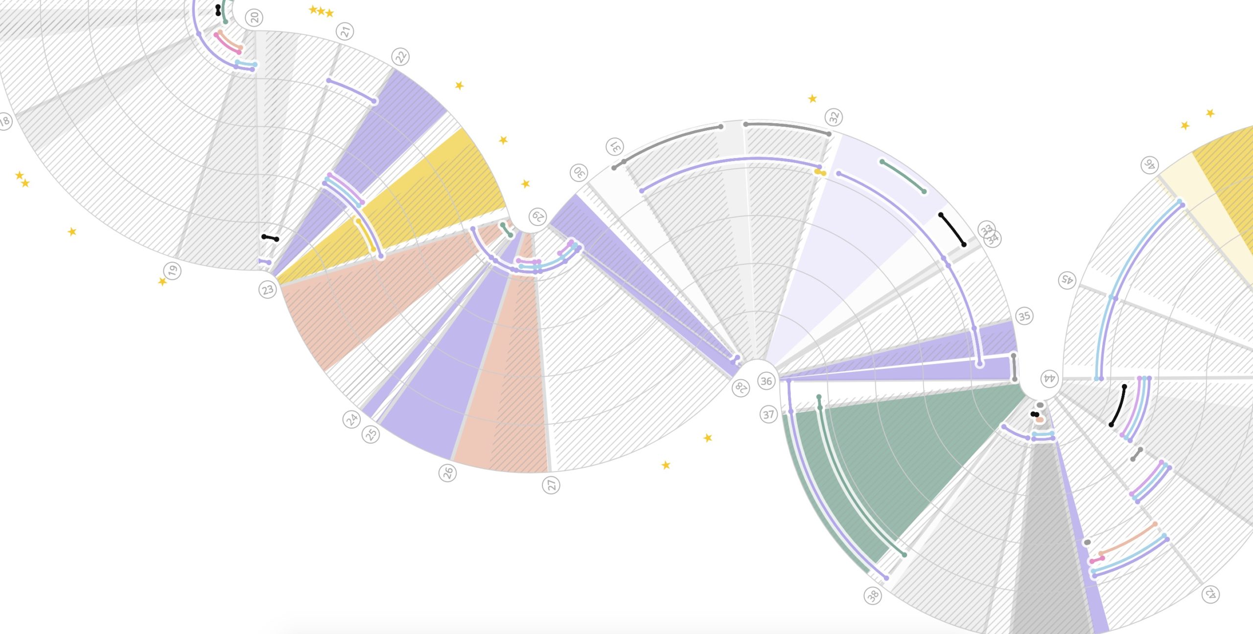
Derived Row Geometries
How many different ways are there to derive a tone row? In 12-tone music, a particular ordering of the twelve chromatic pitch classes — the row — is used as the basis to compose a piece. Some composers were interested in ways of generating a 12-tone row from a single set class: a collection of unordered pitch-class sets where all sets are the same size and relate to one another by transposition or inversion. In a derived row, a single set class partitions the chromatic scale into discrete, non-overlapping segments. This chart uses visualization to show all possible partition geometries of tone rows for valid set classes, revealing the symmetries and asymmetries of derivation.
Atomic Narratives
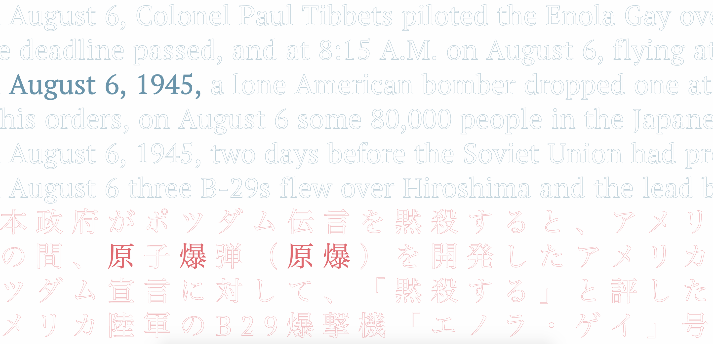
On August 6, 1945, the United States dropped an atomic bomb on Hiroshima, Japan. A few days later, on August 9, the United States dropped a second atomic bomb on Japan, in Nagasaki. Shortly thereafter, Japan surrendered, ending World War II. If this sounds familiar, it is for good reason: this is the standard narrative of the end of World War II that is often found in high school history textbooks. But what would it mean to examine those narratives in a new way, with a critical lens that challenges the authority to which they lay claim? In this project, we analyzed excerpts from U.S. and Japanese high school history textbooks to explore their parallels and differences.
Sono Toki
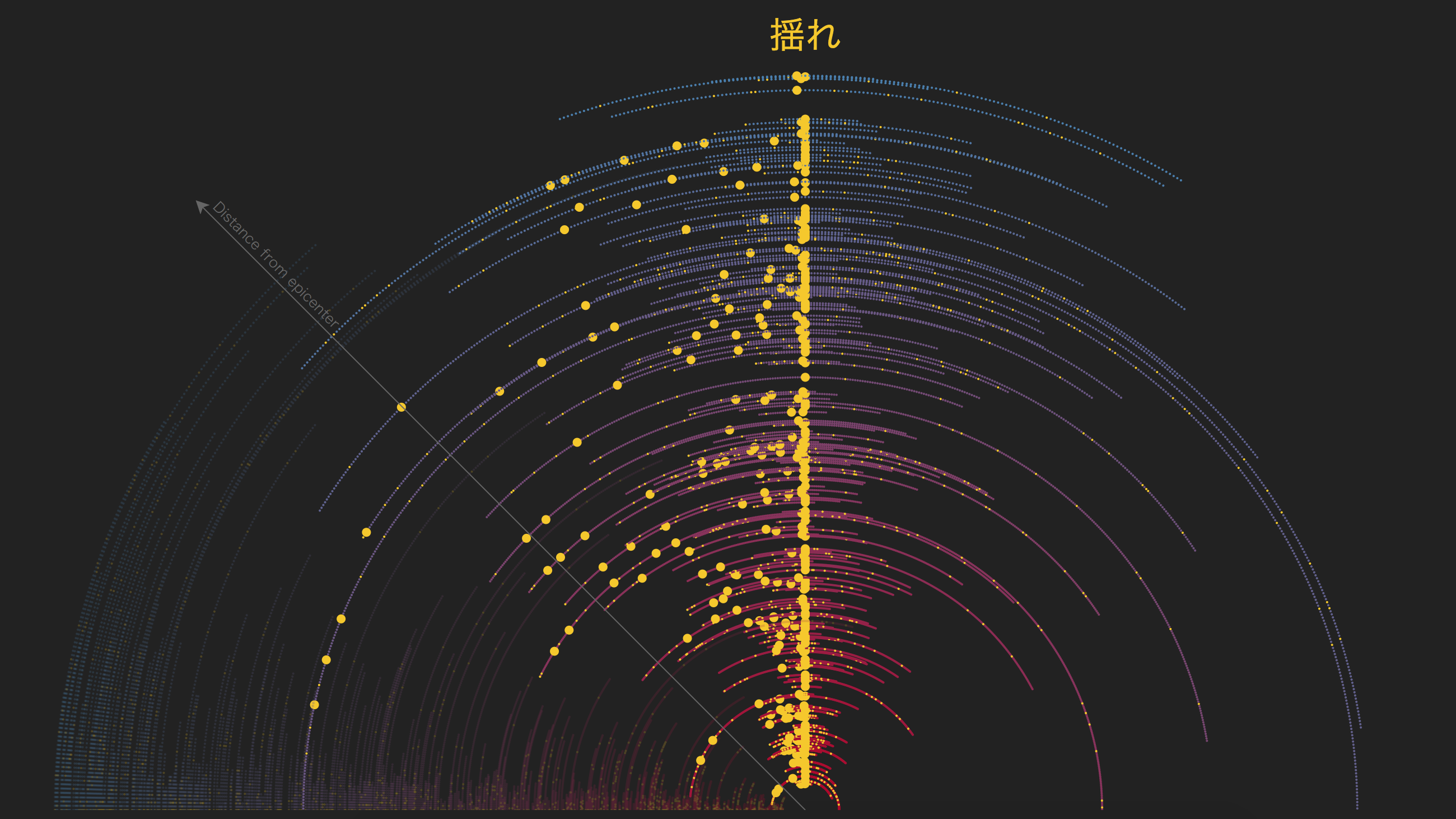
On March 11, 2011, a magnitude 9.0-9.1 earthquake struck off the coast of Touhoku, Japan. The Japan Disasters Archive (JDA), a project from the Reischauer Institute of Japanese Studies at Harvard University, seeks to archive websites, news articles, video, images, and other media related to the March 11 disaster and its aftereffects in the time since. There are many different ways to capture the experience of a disaster. In this series of visualizations, one subset of media from the JDA — a collection of testimonials about individuals' experiences of the disaster — is mapped and annotated. The testimonials portrayed here are responses to the question, What were you doing at the time the disaster struck?
Women Writers Project Cultures of Reception
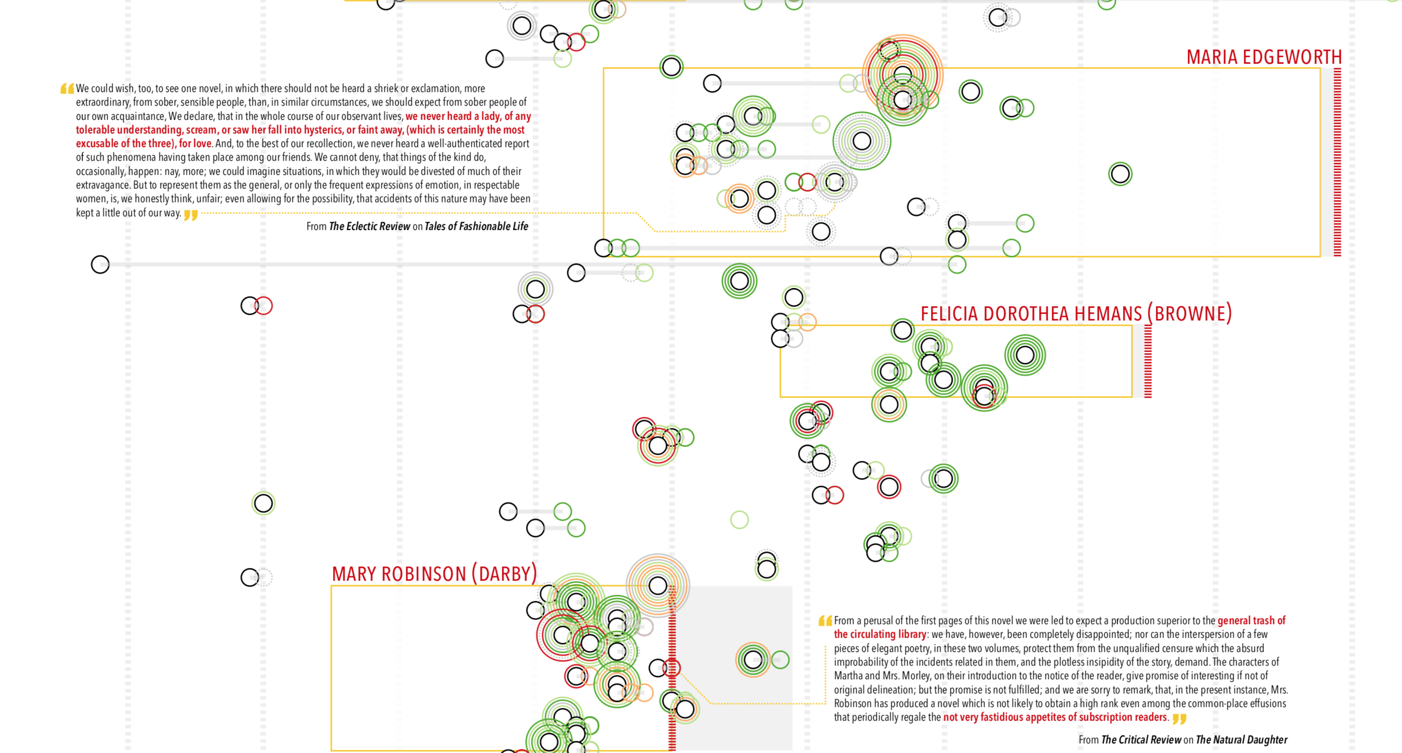
Women Writers in Review is a collection of eighteenth- and nineteenth-century reviews, publication notices, literary histories, and other texts responding to works by early women writers. Women Writers in Review is published by the Women Writers Project at Northeastern University and was created as part of the Cultures of Reception project, which was designed to investigate the discourse of reception in connection with the changing transatlantic literary landscape from 1770 to 1830. In this visualization, each circle represents an author's received work or a reception document about that work.
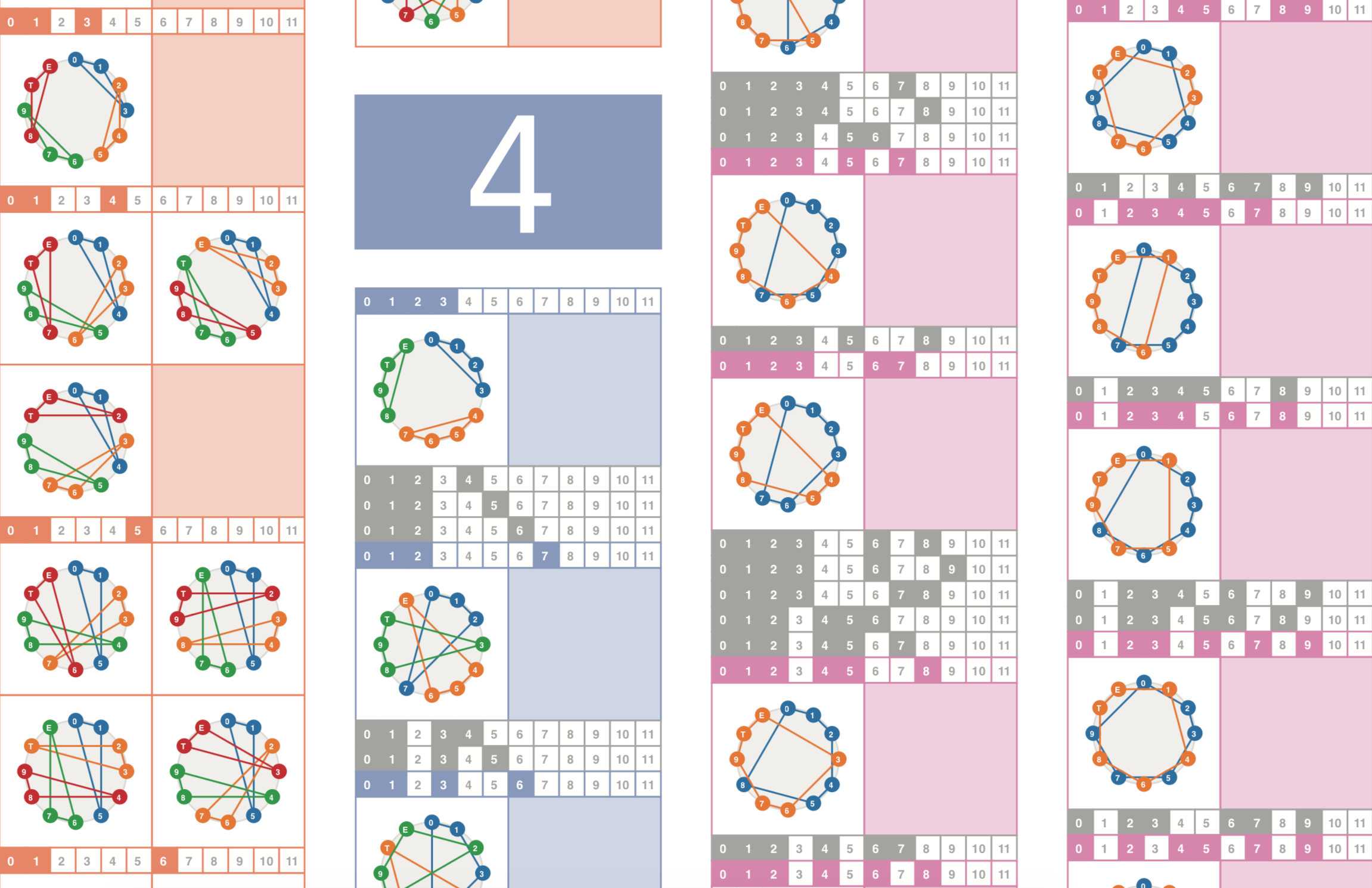
Kanji Deconstructed
Learning Japanese characters, or kanji, can be daunting for any non-native speaker of the language. Kanji can be structurally complex by many different measures, only one of which is the number of strokes it contains. Another measure is the number of individual components, or radicals, that make up a single character. In this visualization, kanji are mapped against one another based on these structural features, illustrating emergent patterns of increasing kanji complexity through the Japanese education system.
Space, Time, and Body Asunder
The Hiroshima Archive houses a digital collection of interviews, audio, and video materials that tell the stories of survivors who experienced the dropping of the atomic bomb in Hiroshima, Japan at the end of World War II. By telling these stories, the Archive aims to keep alive the voices of those who narrowly escaped one of the cruelest events of death and destruction in human history and to open dialogue on peace, resilience, and disarmament in a nuclear era. In this project, I seek to represent these voices through a different perspective — one that is about the fragmentation of body, space, and time that resulted from the bomb and its effects thereafter.
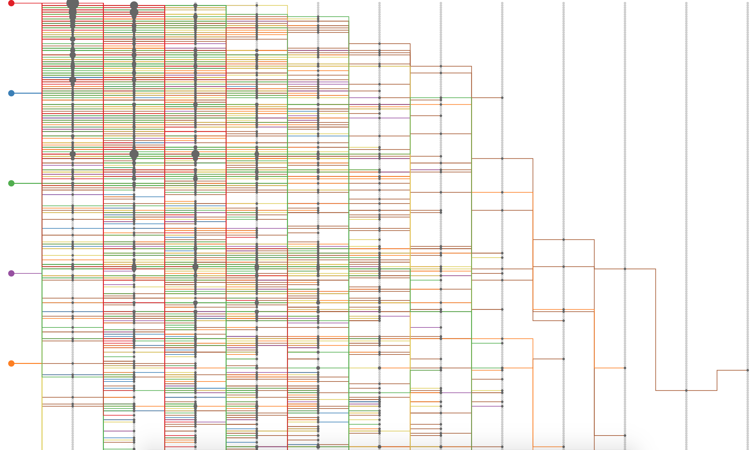
IN/EFFLUX: Visualizing Snell Library Statistics
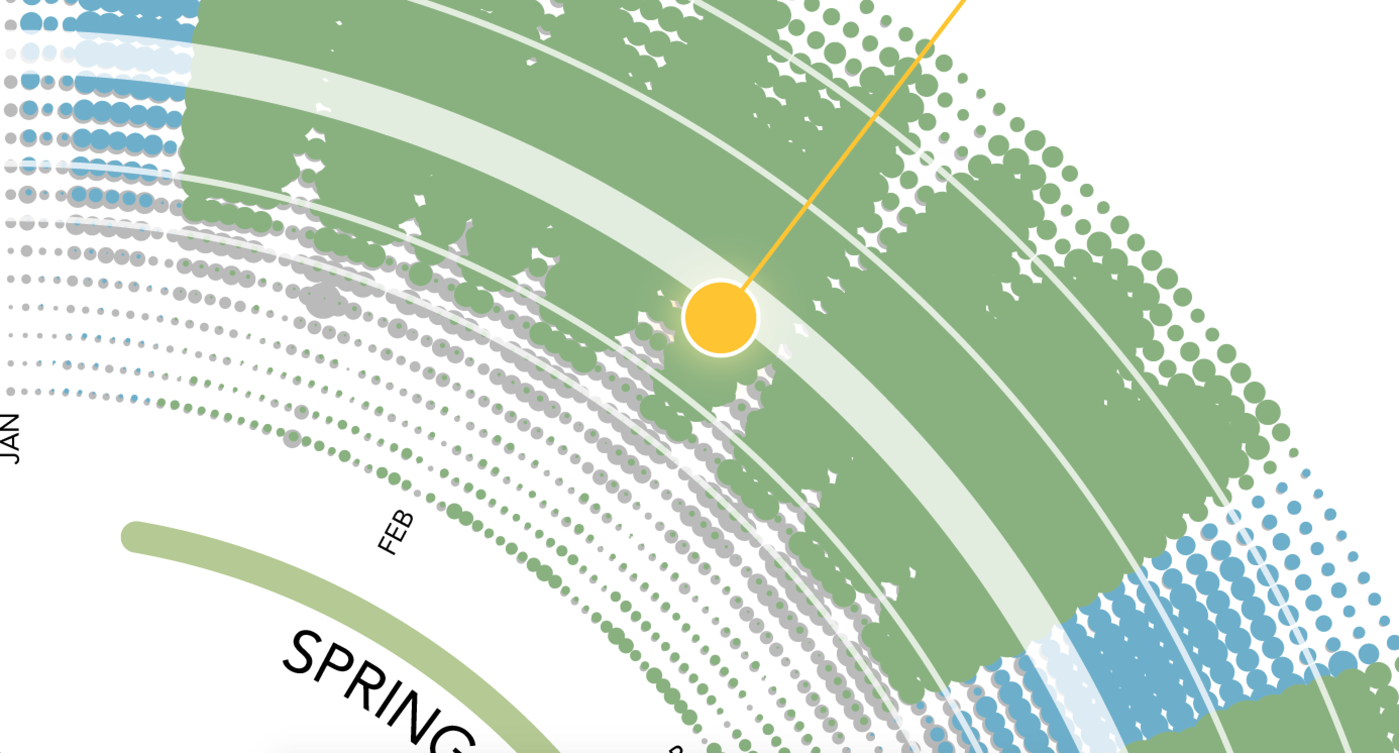
Traditional characterizations of library collections and spaces tend to focus on static measures of reach, such as collections size and frequency of reference desk consultations. While these kinds of measures provide some insight into libraries' impact, they offer at best a snapshot of how patrons use their space and resources. In this visualization, created for Snell Library at Northeastern University, I seek to portray the library as a living, breathing ecosystem.